Eseandre Mordi

Tesla's weekly chart tells a story that most traders might miss if they're looking at the wrong things. According to Danny Cheng, the key to reading TSLA right now isn't candle patterns or momentum indicators - it's the volatility zones that define where price actually reacts.
How TSLA Stock Rotates Through Buy and Sell Zones
The chart maps out multiple BUY and SELL zones clearly, showing how Tesla has moved through cycles of accumulation and distribution rather than trending in any clean direction.
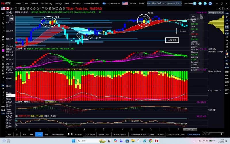
A SELL cluster sits near the $420-$430 region, where price stalled and rolled over. That rejection kicked off a gradual pullback, confirming that upward momentum had peaked.
The most critical level now sits at $323.91 - the longest momentum bar on the entire chart.
What makes this framework different from standard technical analysis is its focus on volatility gaps rather than candle color or pattern recognition. These horizontal structures mark where price has historically reacted most strongly, making them the backbone of the current read on TSLA's trend.
$323.91 - The Level Defining TSLA's Next Move
Price is moving toward $323.91 after failing to hold higher levels. The structure shows a controlled transition from upward movement into a pullback - no aggressive breakdown yet, but the direction is clearly lower for now.
This places TSLA Stock Builds Base Near 325 MA, Eyes $420 territory front and center. Price stabilization near major averages often signals a transition phase rather than a straight continuation of the prior trend - something the current setup reflects closely.
Price is moving into a high-stakes area where prior momentum concentrated - and how it reacts here will define the next phase.
The tightening range between prior resistance and this support zone is the setup. Everything hinges on what happens at $323.91.
A Technical Framework Built Around TSLA Reaction Zones
Shifting focus away from RSI or MACD toward volatility holes changes how you interpret what TSLA is doing. Several things stand out from the current chart:
- SELL signals align with rejection near recent highs
- BUY signals appear after pullbacks settle into lower zones
- Price is now approaching the most significant support level on the chart
- The overall structure reflects rotation, not a clean directional trend
When price reaches the strongest reaction zone on the chart, the outcome there sets the tone for everything that follows.
TSLA Slides Below 200DMA as Bearish Trend Deepens reinforces this point - holding key support becomes the decisive factor whenever momentum weakens. The current setup fits that description precisely.
What Breaks or Holds at This TSLA Support Level
Two outcomes are on the table from here. If price stabilizes at $323.91, the broader range structure stays intact and the pullback remains controlled. If that level breaks, the chart shifts into a deeper corrective phase - extending the weakness that's already visible.
TSLA Drops to $350 as Corrective Pattern Hints at Later Recovery offers a comparable setup - controlled pullbacks of this kind often precede the next directional move rather than signaling outright breakdown.
For now, TSLA remains in a structured pullback. The next move is almost entirely a function of how price handles the $323.91 zone.
 Eseandre Mordi