Editorial staff
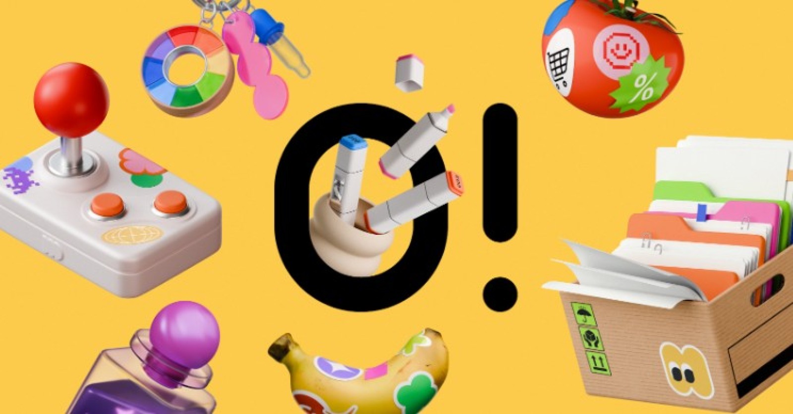
Over the past few weeks, I have been testing Ouch by Icons8 to answer a central question. Can off the shelf libraries actually support a coherent brand system, or do you always need fully custom artwork to look professional?
Mapping the Complete User Journey
Building a seamless user experience requires visual consistency from the first touchpoint to the final conversion. When a lead product designer maps out a new application flow, they need graphics for onboarding screens, empty states, error messages, and success notifications.
Using Ouch, the designer filters the library to select one of the 101 available illustration styles. They might choose a minimal monochrome look or a sketchy style to match the brand tone. Instead of downloading rigid, pre-made scenes, they access layered vector graphics broken down into tagged, searchable objects. For the login screen, they pull a specific character and a UI card element. Because the styles are designed specifically for consistent UX coverage, they easily find matching assets for the add-to-cart and checkout pages. By upgrading to a paid plan, they export these files as SVGs. This allows them to adjust the stroke weights and apply exact brand colors directly within their design software, resulting in a unified visual sequence across the entire application.
A Typical Workday Managing Content Assets
Let us look at how a content manager named Lin operates during a standard morning using these tools. She starts her day drafting a text-heavy blog article about corporate communication. To keep readers engaged, she needs visual breaks throughout the long content. Opening the Pichon desktop app, she filters for the "Free" badge and drags a transparent PNG directly onto her article draft.
Next, she needs an animated graphic for a social media post promoting the same article. She searches the Ouch library for the exact same illustration style she used in the blog, finds an animated version of the scene, and downloads the Lottie JSON file to hand off to the frontend developer. Before lunch, she needs a custom header image for an afternoon email campaign. She opens the Mega Creator online editor, recolors a few static objects, rearranges the elements on the canvas, and exports the final brand-ready asset.
Rapid Prototyping for Web Applications
A frontend developer building a new SaaS landing page needs to move fast. They lack an in-house illustrator but need the site to look highly polished and trustworthy. They start by searching the 23,000 technology illustrations available in the library.
They decide to use 3D graphics to make the hero section stand out. Filtering through the 44 different 3D styles crafted by professional 3D artists, they locate a set of tech-focused objects. They download the FBX format models and manipulate the camera angles in their native 3D software to fit the layout perfectly. For the feature sections below the hero area, they need matching animated elements. They browse the massive library of illustrations to find Rive animations and After Effects project files within the same style category. They tweak the animation timing to match the scroll speed of the page and export the final assets as MOV files. The result is an interactive, premium landing page built entirely without commissioning custom 3D work.
Weighing the Alternatives
Building a visual identity requires looking at all available options in the market.
unDraw offers a single, recognizable style where you can easily change the primary hex color. It works well for quick wireframes or hackathons. It falls short if you want a unique brand identity because the web is heavily saturated with that exact style.
Blush allows for high customization of specific artist collections. You can swap out character heads, expressions, or limbs. It is excellent for diverse character building but lacks the sheer volume of business, healthcare, and technology objects found in Ouch.
Custom illustration remains the gold standard for brand uniqueness. You get exactly what you want tailored to your exact messaging. The trade-off is budget and time. You must brief an artist, wait for sketches, manage multiple rounds of revisions, and pay per asset.
Limitations and when this tool is not the best choice
Ouch provides thousands of professional illustrations, but it is still a pre-packaged library. If your brand relies on a highly specific visual metaphor or a completely novel art style, you will hit a wall quickly.
The free tier is highly restrictive for professional workflows. You are limited to PNG formats and you must include a link back to Icons8 for attribution. This is not viable for enterprise landing pages or premium mobile apps.
While you can swap parts and rearrange elements in the Mega Creator editor, you are ultimately bound by the poses and angles provided by the original artists. If you need a character doing a very specific, niche action, you will not find it.
If you need exclusive rights to a mascot or a hero image that no other company can use, a stock library is the wrong path. Other companies have access to the exact same 3D models and vector styles, meaning your competitors could theoretically launch a campaign using the exact same graphics.
Practical Tips for Working With Pre-Packaged Vectors
- Commit to a single style: Mixing a sketchy look with colorful 3D models breaks brand coherence immediately. Pick one of the 101 styles and use it strictly across all touchpoints, from your homepage to your error screens.
- Install the Pichon app: Relying on the browser slows down asset gathering. The desktop application allows you to drag and drop transparent PNGs directly into your design canvas.
- Leverage rollover credits: Paid plans allow unused downloads to roll over to the next period. Group your asset gathering into focused design sprints to maximize the value of your subscription.
Break apart SVGs: Upgrade to access the SVG files. Ungroup the layers in your design software and delete unnecessary background elements to create cleaner, minimal compositions that fit your specific layout needs.
 Editorial staff