Alex Dudov
SoFi stock has entered a far tighter institutional setup after dark pool activity shifted almost entirely to one price. According to an analysis by Fibby, last week's dark pool positioning was spread between $16 and $17, while this week the structure collapsed into a single dominant level at $15 - replacing a broader range with one concentrated anchor.
The chart supports that directly. The green dark pool bar at $15 towers over every other price band, with 143,277,842 shares registered there versus much smaller readings at $16, $15.90, $14.90, and $14.
When 143.3 million shares cluster at one level, that price stops being just another reference point and starts acting as the center of the entire near-term trade.
One SOFI Price Level Took Control of the Setup
The most important feature in the chart is not simply that $15 carries the most volume. It is that nearly everything else is negligible by comparison. The nearby levels show only modest participation, which makes the $15 zone look less like one support among many and more like the institutional anchor for the whole setup.
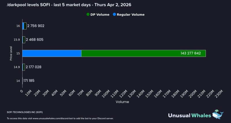
That is also the cleanest way to read the positioning. It does not argue for a breakout or collapse on its own. It argues that institutions have shifted their focus down by roughly a dollar, and that the stock is now trading just above the new center of gravity. With price around $15.85, SOFI is hovering only slightly above that anchor, leaving little room for ambiguity about what level matters most.
The $15 zone is not one support among many - it is the institutional anchor for the whole setup, with nearly everything else negligible by comparison.
The Drop From $16-$17 Now Frames the SOFI Trade
What changed here is structural. A week ago, the dark pool range was distributed higher. Now that range has been replaced by a single concentration at $15. That shift mirrors the price decline and changes how traders are likely to interpret the chart.
If SOFI can stay above $15, the level can continue to function as the base from which price attempts to rotate back toward the former $16-$17 zone. If it slips below, the problem is not just technical weakness. It is the lack of comparable volume support underneath. The chart itself shows very little beneath the anchor, which is exactly why $15 has become the defining number right now.
Why the SOFI Chart Looks More Fragile Than Last Week
This setup is cleaner, but also thinner. A wider distribution can absorb volatility across multiple prices. A single-volume node cannot do that as easily. The concentration at $15 gives SOFI a very obvious institutional reference point, but it also makes the stock more dependent on that one number holding.
SOFI is no longer balancing across several strong levels. It is balancing on one - and that makes the next move cleaner, and sharper, than the last one.
That is why this dark pool chart reads less like a broad accumulation range and more like a narrow institutional decision zone. SOFI now has a single anchor and very little room to drift.
 Alex Dudov