Saad Ullah

A simple side-by-side chart captures one of the clearest lessons in long-term investing: compounding does not widen outcomes gradually, it widens them exponentially. As Nicolas Chéron noted, Berkshire Hathaway under Warren Buffett compounded at about 20% annually since 1965, while the S&P 500 returned about 10.5% a year. That difference turned $100 invested in 1965 into roughly $6.1 million versus about $45,000 for the index.
When Return Differences Stop Looking Small
At first glance, the gap between roughly 20% a year and 10.5% may not seem large enough to create radically different outcomes. Over a few years, it would not. Over six decades, it changes everything.
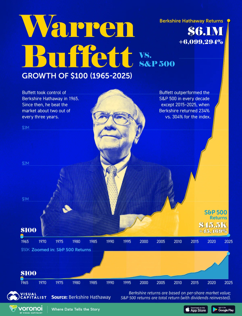
The chart makes that visible. Both Berkshire Hathaway and the S&P 500 move higher over time - but they do not climb at the same speed. Berkshire's curve becomes dramatically steeper as the years pass, while the S&P 500 rises more gradually. The longer the timeframe, the more aggressive the separation becomes.
A Visual Lesson in Exponential Wealth Creation
What stands out most is not that the S&P 500 performed poorly. It did not - turning $100 into roughly $45,500 is a powerful long-term result on its own. The chart instead shows how sustained outperformance compounds into a completely different scale of wealth creation.
That is the real force behind Buffett's long record. Each additional point of annual return builds on an increasingly larger base, and over time that process stops looking linear and starts looking exponential. The chart's final years make that unmistakable, with Berkshire pulling away sharply from the index in a way that small annual differences simply cannot explain without understanding compounding.
Berkshire Hathaway Falls Behind the S&P 500 adds important nuance to the long-term picture, showing that even Buffett's record has experienced periods where the index closed the gap - a reminder that the compounding advantage requires consistency across decades, not just years.
Why the Berkshire vs S&P 500 Chart Resonates Beyond Buffett
The comparison works because it strips investing down to its most important variable: time. There is no need for complex modeling to understand what the visual shows. A higher return, maintained consistently, creates an outsized gap that becomes almost impossible to close later.
SPY Tests Long-Term Trendline Near $5,580: S&P 500 Approaches 3-Year SMA Support provides current context for the index side of this comparison, showing where the S&P 500 sits within its own long-term structure - the same structure that, compounded over decades, still produced the $45,000 outcome the chart shows.
S&P 500's 16% Gain in 2025 Fits Right Into 100 Years of Market History reinforces that the 10.5% long-term average is not an anomaly but a historically consistent return - making Buffett's ability to sustain nearly double that rate over 60 years all the more remarkable as a compounding achievement.
The takeaway is not only that Berkshire beat the market. It is that long-term compounding can turn what looks like a modest annual edge into an outcome that changes the scale of what is possible entirely.
 Saad Ullah