Saad Ullah
⬤ A newly circulated long-term XRP chart is getting attention for mapping out over a decade of price movement through the lens of rising trendlines and repeating consolidation cycles. The analysis shows how XRP has historically worked its way through expanding price channels, followed by correction periods, before pushing into new territory. The current setup looks remarkably similar to earlier phases that came right before major rallies.
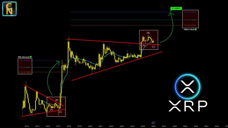
⬤ Two major historical cycles stand out on the chart, both showing similar corrective patterns that eventually broke higher within the broader uptrend. During the first cycle, XRP spent time consolidating inside a rising channel before breaking out sharply and hitting several Fibonacci extension targets—marked as "secured" on the chart. Those levels include the 1.272, 1.414, and 1.618 extensions, showing exactly how past upside moves played out within this larger technical framework.
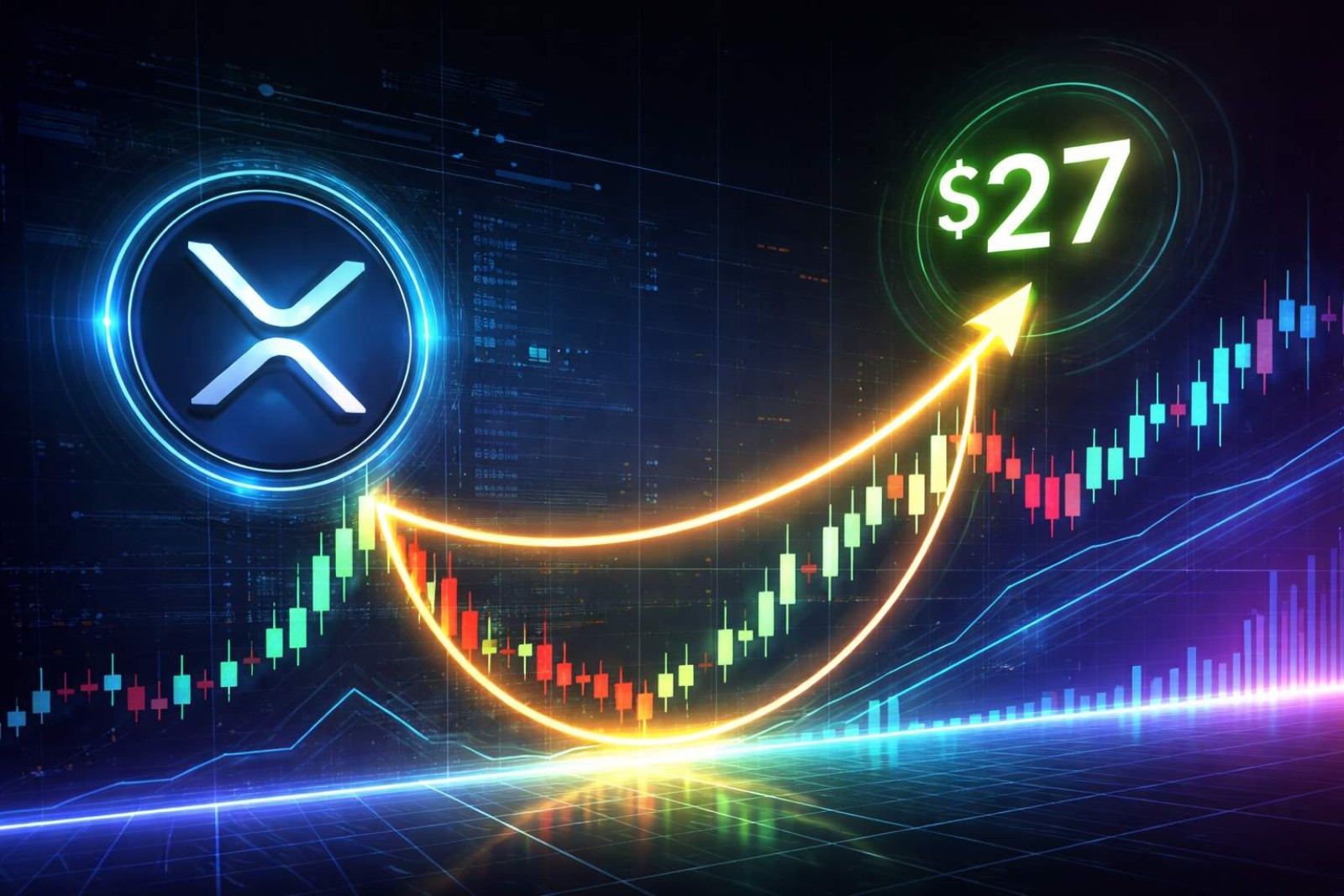
⬤ Right now, XRP seems to be building a similar pattern. Price is holding above long-term rising support while sitting below a descending resistance line. The Fibonacci targets for this phase are labeled "pending," meaning they're projections rather than completed moves. One key level highlighted is around $27.06, which lines up with where this long-term trend could extend if the pattern continues to follow its historical blueprint.
⬤ What makes this chart worth paying attention to is how it frames XRP's behavior across full market cycles instead of just zooming in on day-to-day action. The mix of pattern repetition, rising structural support, and clear Fibonacci projections shows how traders use long-duration technical models to set expectations over years, not weeks. There's no timeline attached, but the chart makes a case that structure and historical rhythm still matter when thinking about where price could eventually land.
 Saad Ullah