Marina Lyubimova
The Gold-to-Silver ratio has long been watched by precious metals traders as a key indicator of relative value between these two assets. Right now, we're seeing a technical setup that mirrors patterns from over a decade ago—patterns that preceded some of silver's most explosive moves.
The Current Technical Picture
Analyst Boz has identified a compelling chart structure that suggests we may be on the verge of another major shift in favor of silver.
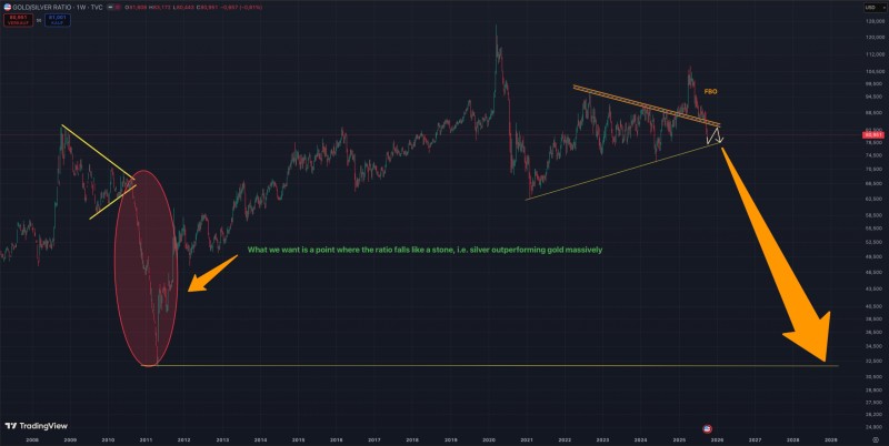
The Gold-to-Silver ratio is approaching what appears to be a critical turning point. The chart reveals a failed breakout (FBO) where the ratio tried to push higher but reversed course, signaling that upward momentum may be exhausted. This isn't happening in isolation—a descending resistance trendline has capped multiple rally attempts over the years, and now the ratio is testing long-term support around the 80 level. This zone has historically acted as a battleground between buyers and sellers.
Looking Back: The 2010-2011 Parallel
What makes this setup particularly interesting is the historical parallel. Back in 2010–2011, we saw a remarkably similar technical configuration. When that setup resolved, it triggered a steep decline in the ratio as silver prices surged dramatically compared to gold. The metal went from trading at roughly 1/70th the price of gold to closer to 1/30th in a matter of months, delivering outsized returns to those positioned correctly.
If the pattern plays out again as the technical analysis suggests, we could see the ratio fall sharply toward the 30–35 zone by decade's end. Such a move would require silver to substantially outperform gold, potentially driven by a combination of industrial demand growth, supply constraints, and shifting investor sentiment toward the more volatile but potentially rewarding white metal.
 Marina Lyubimova