Sergey Diakov

⬤ Gold is pushing higher in a way that's catching attention because it looks remarkably similar to previous major rallies. Gold doesn't just rise randomly—it climbs for real reasons, and the bigger the economic pressure, the steeper the climb. A recent chart comparison reveals how today's gold price structure lines up with two critical periods: the 1970s stagflation era and the 2008 global financial crisis, showing similar acceleration phases across all three.
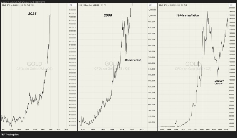
⬤ The current gold cycle shows prices building gradually before suddenly shifting into steep upward momentum. This mirrors the 2008 period almost perfectly, when gold rallied hard, went through sharp volatility during the market crash, then kept climbing higher. The 1970s comparison is equally striking—gold surged amid inflation and economic chaos, experienced sharp corrections, then continued its broader climb upward.
⬤ The strongest gold advances never happen in isolation. They unfold alongside elevated uncertainty and crumbling confidence in traditional assets. Gold rallies historically move in waves—rapid price jumps interrupted by temporary pullbacks, not smooth straight lines. The current structure fits that pattern, suggesting gold is responding to real economic forces rather than short-term trading hype.
⬤ These historical parallels matter because gold serves as a warning signal during periods of structural change. When gold behavior mirrors past crisis-driven rallies, it typically reflects growing concerns around inflation, monetary stability, or financial system fragility. The chart comparisons reinforce why traders and investors continue watching gold closely as an indicator of deeper macroeconomic shifts underway.
 Sergey Diakov