Saad Ullah

⬤ A new death cross just showed up on the XRP chart—that's when the short-term moving average drops below the long-term one. The same setup appeared in 2017 and 2020, both times landing right around what turned out to be major bottoms. Side-by-side comparisons show all three periods with the crossover circled on each chart, and the visual similarity is pretty striking.
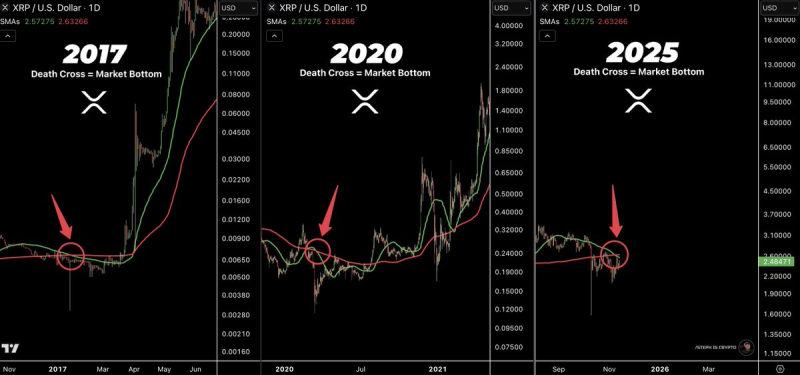
⬤ Back in 2017, the death cross hit right before XRP went on a roughly 10,000% tear. The 2020 version played out similarly, forming near another bottom that kicked off a run of about 1,000%. Now in 2025, the same moving-average crossover is forming in the current price zone, with recent action hugging those indicator levels.
⬤ Each crossover landed during a consolidation phase before bigger moves took off in earlier cycles. The 2025 chart shows the fresh crossover without confirming any direction yet—XRP's still stuck in a tight range around the moving averages. The pattern's getting attention because traders lean on historical structures to sniff out sentiment shifts, though matching visuals don't guarantee what happens next.
 Saad Ullah