Usman Salis
⬤ XRP is heading toward a new death cross on its daily chart, where the 100-day moving average crosses below the 200-day moving average. The setup looks strikingly similar to what happened in early 2017, and chart comparisons are making the rounds showing these parallel structures right before previous major trend changes.
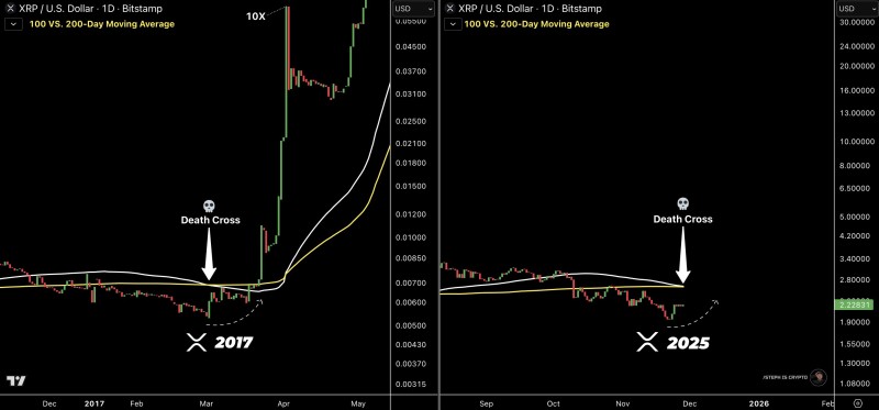
⬤ The comparison shows two timeframes: early 2017 and late 2025. Back in 2017, XRP moved sideways around these moving averages before exploding upward in a rally that eventually delivered over 10x gains. Now in 2025, XRP is trading just under those same converging lines again, with the death cross looking ready to form based on current price action.
⬤ The visual similarity is hard to ignore, though nobody's saying it's a guaranteed repeat. What's interesting is how XRP consolidates below both trend lines as the cross develops – the pattern is nearly identical. There's a dotted curve suggesting XRP might be finding support after recent drops, but the chart itself stays neutral on what comes next beyond confirming the moving average cross.
⬤ Death crosses matter because they shift market sentiment and change how traders read momentum. When major moving averages interact like this, people pay attention. Repeating historical patterns become talking points around risk assessment and what might unfold next in the crypto market.
 Usman Salis