Peter Smith

⬤ Precious metals traders saw wild swings in January as the Gold/Silver ratio went on a rollercoaster ride. Silver caught fire early in the month, driving the ratio down to 43.4—a level not seen since August 2011. That's way below where this ratio usually hangs out, and the chart makes it pretty clear just how unusual this move was.
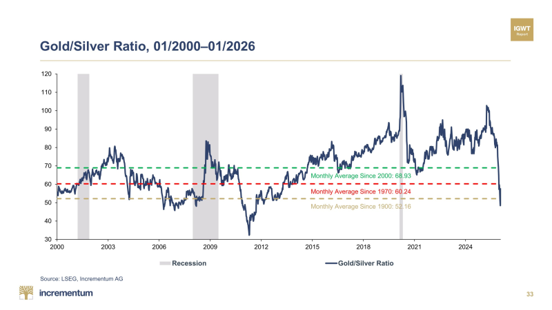
⬤ Looking at the numbers, the Gold/Silver ratio typically sits around 68.9 over the past two decades, 60.2 since 1970, and 52.1 going all the way back to 1900. So when it crashed to 43.4, silver was absolutely crushing gold in performance terms. This kind of extreme move usually happens when silver catches a serious bid rather than gold falling apart.
⬤ But the party didn't last. By the end of January, reality set in and the ratio climbed back to 57.5, settling right in the middle of its long-term comfort zone. This kind of whipsaw action isn't entirely new—similar patterns have shown up before during periods when market leadership bounces between the two metals. The Gold/Silver ratio rebounds pattern has played out multiple times historically.
⬤ What this means is the market pulled back from an extreme imbalance toward something more normal rather than locking in a new long-term trend. These rapid swings between extremes often signal that leadership is changing hands in the precious metals space. For context on how these cycles develop, check out the Gold/Silver ratio long-term setup and the recent silver breakout outlook.
 Peter Smith