Marina Lyubimova
⬤ SoFi Technologies is back in the spotlight thanks to a long-term price chart that's turning heads. The projection shows a massive multi-year recovery and expansion, painting SOFI as a long-duration growth play that transforms from early turbulence into a powerful upward climb accelerating toward decade's end.
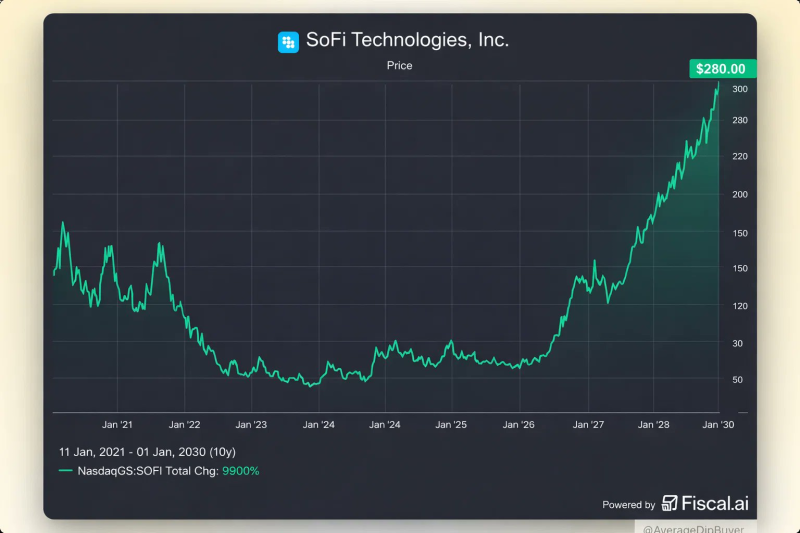
⬤ The chart covers roughly ten years, starting in early 2021 and running through early 2030. It captures SOFI's wild ride—significant price swings and a brutal decline between 2021 and 2023, followed by stabilization through 2024 and 2025. Then things get interesting. The stock shifts into sustained rally mode, with the steepest gains kicking in around 2026. By the chart's endpoint, SOFI approaches $280 per share.
⬤ The numbers tell a striking story: a cumulative price change of approximately 9,900% over the full period. The chart emphasizes trend persistence over short-term noise, showing consistently higher highs during the later stages. Rather than dwelling on intermediate pullbacks, it focuses on the broader directional shift that emerges after years of consolidation and recovery.
⬤ This matters because long-term charts shape how investors view growth companies across extended cycles. A sustained multi-year uptrend influences expectations around scale, valuation, and competitive positioning in fintech. The chart reframes SoFi's narrative—showing how extended recoveries can flip sentiment after painful drawdowns and refocus attention on long-horizon growth potential beyond near-term market jitters.
 Marina Lyubimova