Marina Lyubimova
⬤ XRP's price action is catching eyes again as a familiar bullish pattern takes shape on the daily chart. The setup shows XRP moving from a strong rally into a correction phase, then stabilizing around a key support zone. What's interesting is how closely this mirrors an earlier formation that kicked off a major price surge, giving traders a reason to watch closely.
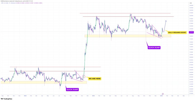
⬤ Looking at the chart comparison, there are two strikingly similar market phases. During the first one, XRP took a quick dip that dropped price into a demand zone before launching into a powerful rally that marked the start of a sustained climb. Right now, XRP has pulled back into a similar support area after sliding down through a descending channel. The bounce from this zone suggests the correction might be losing steam.
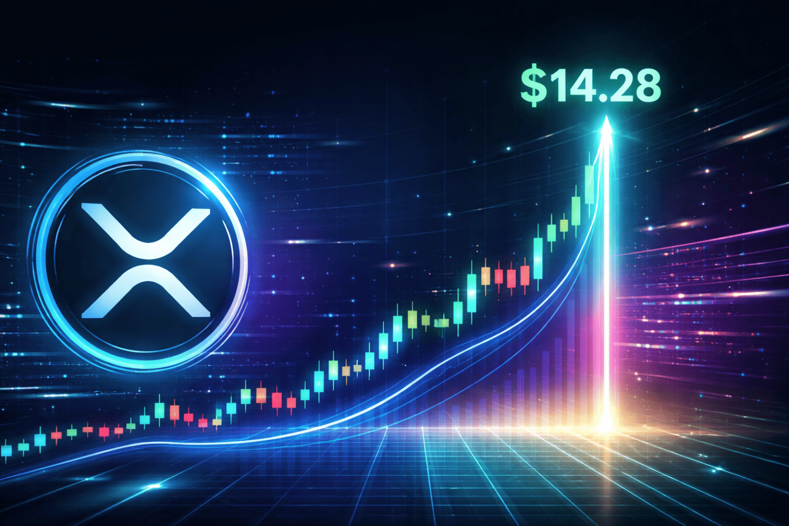
⬤ The pattern itself is pretty straightforward: a sharp move up, a measured pullback to support, and early signs of recovery. The visual comparison on the chart shows how both corrections match up in terms of depth and structure. If XRP continues holding above support and pushes higher, price could target elevated resistance levels. Based on this historical comparison, the projection stretches as high as $14.28, though there's no specific timeline attached and it all depends on whether the structure plays out as expected.
⬤ This setup matters beyond just XRP because it's one of the most liquid altcoins and tends to influence sentiment across the broader crypto market. When price patterns repeat with similar characteristics, they become reference points for momentum shifts and volatility expectations. With XRP stabilizing after its correction and showing a structure that mirrors a previous bullish cycle, the next moves could shape how traders view trend continuation and overall market sentiment in digital assets.
 Marina Lyubimova