Peter Smith

⬤ Silver's been pushing higher within a decades-long bullish formation, with prices now nearing the upper boundary of this long-term structure on a log scale. The current phase suggests the broader bull market still has room to run, but traders should be ready for a substantial corrective move. Strong upside momentum has historically come hand-in-hand with elevated volatility near major trendlines.
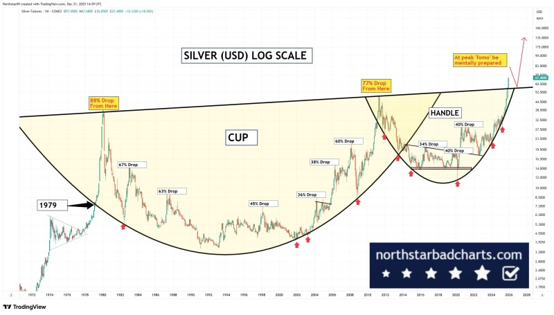
⬤ The chart shows a massive cup-and-handle pattern running from the late 1970s to today. Inside this structure, you can see multiple historical corrections labeled with drawdowns ranging from about 36% to over 80% after previous peaks. These drops happened even as silver stayed within its bigger upward trajectory. Current prices sit near the upper trendline—an area that's previously marked exhaustion points before significant pullbacks.
⬤ The recent price surge has brought silver close to levels where past rallies reversed sharply. The chart points to several instances where advances got slammed with corrections of 40% or more before the long-term trend picked back up. This history shows that corrections are just part of how silver bull markets work, not signs of structural breakdown. The evidence suggests volatility and corrective phases are normal at these elevated price levels.
⬤ This setup matters because silver reflects both monetary shifts and industrial demand. Big corrections within an ongoing bull phase can ripple through commodity-linked assets, inflation expectations, and overall market sentiment. The current structure drives home the importance of historical perspective—showing that major pullbacks have happened repeatedly even as silver climbed higher over time. Whether prices consolidate or correct from here, the chart supports the view that the broader bull trend remains intact while near-term risks are rising.
 Peter Smith