Usman Salis

⬤ Silver experienced a brutal late-week sell-off, and the monthly chart tells you exactly why. Price had just completed an incredibly stretched monthly candle after months of relentless buying. The setup was clear: silver had pushed so far beyond normal volatility limits that a violent snapback became inevitable.
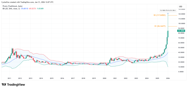
⬤ The upper Bollinger Band on the monthly timeframe sits around $69.52. Silver's monthly high? Roughly $121.67. That's a 75% extension above the band—something the market hasn't seen since January 1980. The chart makes it obvious: this wasn't a healthy breakout. It was a parabolic blow-off.
The only other time silver traded this far above its upper monthly Bollinger Band was in January 1980.
⬤ Bollinger Bands measure typical price variation. When you're trading 75% outside that range, you're not in a sustainable trend—you're in a speculative frenzy. The visual on the chart shows silver rocketing through every statistical boundary, leaving behind a structure that screamed exhaustion rather than continuation.
⬤ Look at the monthly candle itself. That massive upper wick shows silver spiked hard but couldn't hold. Bulls pushed price to extremes, then lost control before the close. This pattern appears repeatedly at major tops, especially when paired with volatility readings this stretched. It's a textbook reversal signal.
⬤ Why does this matter? Because extreme deviations from long-term volatility bands don't resolve gently. When price extends this far beyond technical norms, even minor momentum shifts trigger disproportionate reactions. The 1980 comparison isn't just interesting—it's a warning. These setups don't happen often, but when they do, they mark pivotal turning points during periods of maximum instability.
 Usman Salis