Marina Lyubimova

⬤ Oracle caught investors' attention after ORCL dropped sharply in early 2025. The decline looks dramatic on daily or weekly charts, but when you pull up the monthly log chart, it tells a different story. Decades of steady growth put the recent move in perspective—it's just a blip in Oracle's bigger picture that's been building since the dot-com crash.
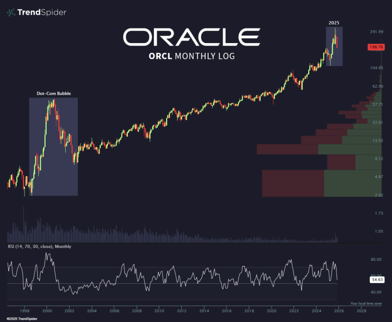
⬤ The chart clearly shows how brutal the 2000–2002 collapse was for ORCL during the tech bubble. That drop was deep and lasted years before the stock recovered. What's happening now doesn't even come close. The 2025 pullback barely registers when measured against Oracle's long-term trajectory. Volume profiles on the chart also point to strong support zones sitting well below today's prices, which suggests the foundation is still solid despite recent choppiness.
The current move resembles a short-term correction rather than a major trend reversal.
⬤ Momentum indicators back up this view. The monthly RSI is hovering around neutral territory, meaning the stock hasn't been oversold or pushed into panic zone. Oracle's pattern of making higher highs and higher lows over the years is still in place, showing that even with short-term wobbles, the long-term uptrend hasn't broken.
⬤ Looking at it this way changes how you read the 2025 dip. It's not a breakdown—it's a normal pause in a healthy long-term trend. ORCL's bigger structure remains intact, and this latest move looks more like the stock catching its breath than changing course.
 Marina Lyubimova