Saad Ullah

U.S. temporary jobs got absolutely hammered in May, dropping 5.12% year-over-year and smashing through that scary-3.5 % threshold that usually shows up right before recessions hit. This isn't just some random dip – it's giving off serious 2008 vibes.
Temp Jobs Are Getting Absolutely Destroyed Right Now
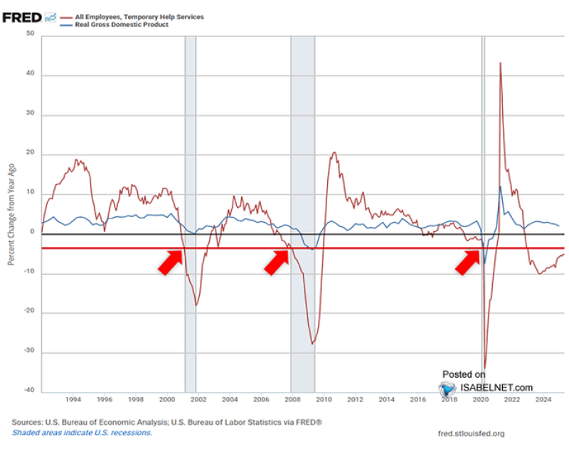
So here's what's going down: Temporary Help Services (THS) employment just face-planted 5.12% year-over-year in May. That red line on the FRED chart is basically screaming "DANGER!" as it crashes through the -3.5% threshold that economists have been watching like hawks for decades.
This isn't some fluke either. When you look at the chart, you can see the exact same thing happened in 2001, 2008, and 2020 – and guess what followed each time? Yep, major recessions that made everyone's life miserable for a while. Those red arrows on the chart are basically pointing at economic disasters, and right now we're seeing the exact same pattern play out again.
The thing that makes this so scary is how reliable this indicator has been. It's not perfect – sometimes temp jobs drop and nothing major happens – but when they crater this hard, it's usually bad news coming down the pipeline. We're talking about a -5.12% YoY drop here, which is way past that warning threshold and deep into "oh crap" territory.
Why Temp Workers Always Get the Axe First
Here's the deal with temporary jobs – they're basically the canary in the coal mine for the whole economy. When companies start getting nervous about what's coming next, the first thing they do is cut the temp workers. It's just easier, you know? No severance packages, no complicated layoff procedures, just "thanks for your time, we don't need you anymore."
That's why smart money people watch these Temporary Help Services numbers like their lives depend on it. When temp jobs start disappearing, it usually means regular full-time jobs are next on the chopping block. The current -5.12% YoY figure isn't just below the signal line – it's way below it, which basically means the economy is flashing red warning lights all over the place.
What's really interesting (and terrifying) is how the Real GDP line in blue on that same chart tends to follow temp job losses with a lag. So first the temp workers get fired, then a few months later the whole economy starts tanking. It's like watching dominoes fall in slow motion, except each domino represents thousands of people losing their jobs.
Everyone's Starting to Freak Out About What Comes Next
The smart money is definitely paying attention now. When you see that red line falling off a cliff while the blue GDP line starts flattening out, it's basically the economic equivalent of watching storm clouds gather on the horizon. Sure, maybe it'll just blow over, but you'd be crazy not to start prepping for bad weather.
Wall Street types, economists, and anyone with half a brain are now gluing their eyes to every piece of labor data that comes out. The U.S. Bureau of Labor Statistics and Bureau of Economic Analysis numbers are showing some pretty ugly trends in how the job market is behaving, and if this keeps up, we could be looking at some serious economic pain later in 2025.
Look, nobody wants to be the person crying "recession!" when everything might turn out fine. But when you've got a signal that's been this reliable for the past 30 years suddenly lighting up like a Christmas tree, you'd have to be pretty damn optimistic to just ignore it. Risk assets could get absolutely hammered if this trend continues, and all those defensive investments that seemed boring might start looking pretty smart real quick.
The bottom line? This temp job crash might not guarantee a recession, but it's definitely the kind of warning sign that makes smart people start battening down the hatches. And honestly, with everything else going on in the world right now, this is probably the last thing the economy needed.
 Saad Ullah