Eseandre Mordi

⬤ A new chart comparing UK unemployment levels with the proportion of working-age people receiving out-of-work benefits has sparked fresh debate about the reliability of official labor data. The discussion reflects growing skepticism about headline unemployment numbers, with concerns extending beyond the UK alone. This comes as gold remains steady amid mixed economic signals across global markets.
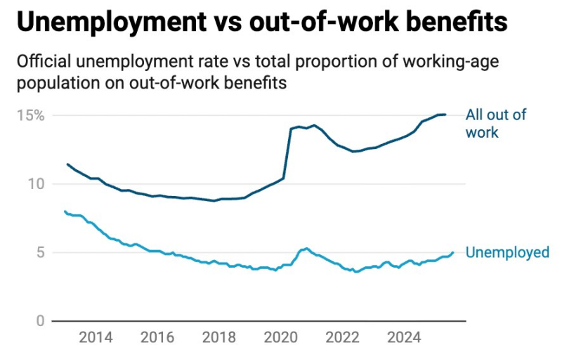
⬤ The chart reveals two lines moving in opposite directions over the past decade. Official unemployment dropped from over 7% in 2014 to around 4% in recent years, with just a slight uptick after 2022. But the share of people claiming out-of-work benefits tells a completely different story. After holding steady through the mid-2010s, benefit claims jumped sharply around 2020 and have stayed elevated at roughly 14-15% through 2024. While unemployment figures suggest a strong labor market, a much larger chunk of working-age people appears to be out of work when you look at who's actually claiming benefits.
⬤ The chart backs up concerns that official unemployment numbers might be hiding the real scale of labor-market problems. The gap could come from differences in eligibility rules, how "active job-seeking" gets defined, or structural changes since 2020 that have kept more people out of the workforce even as headline unemployment stayed low. For macro-sensitive assets like gold, these questions about data accuracy matter because they shape how markets read the broader economic picture.
⬤ The growing split between official unemployment and benefit usage highlights a major blind spot in judging labor-market health. When widely-watched indicators don't line up, it gets harder to know what's really happening with the workforce, which affects expectations around economic strength, policy moves, and consumer stability. The renewed debate shows that headline stats alone might be missing key underlying trends.
 Eseandre Mordi