Marina Lyubimova
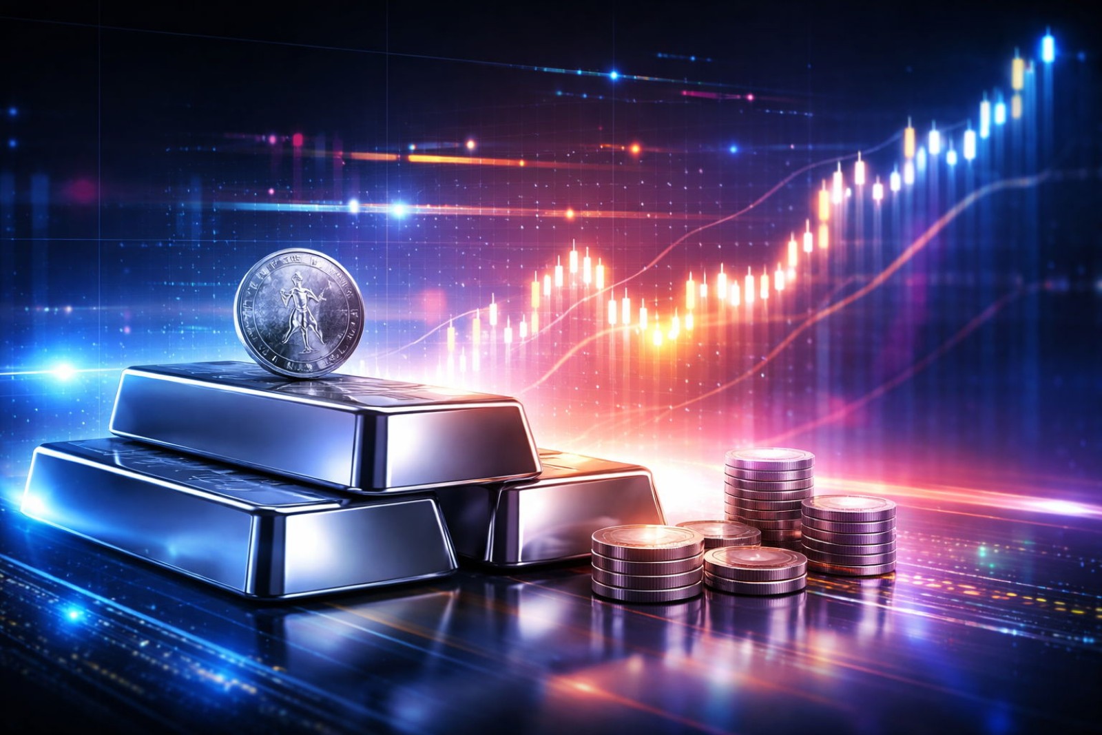
⬤ Silver kicked off 2026 at prices that haven't been this stretched in decades. The metal's now trading about 100% above its five-year moving average, hitting levels last seen near the dramatic peaks of 1980 and 2011. Bloomberg Intelligence data shows this kind of premium has consistently marked zones of extreme enthusiasm—and extreme risk.
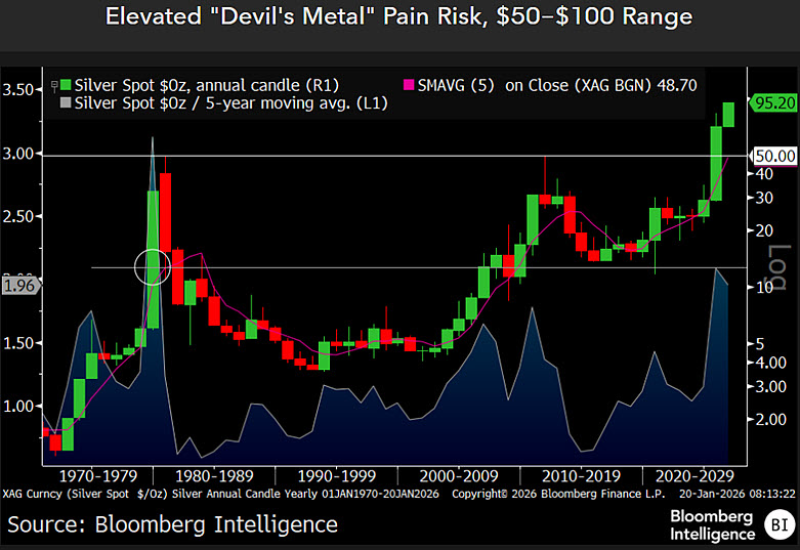
⬤ Looking at the long-term chart, silver's current position stands out sharply. The gap between spot prices and the five-year trend has widened to one of its most extreme levels in modern history. This isn't just a strong rally—it's price momentum that's completely outrun its long-term foundation. The chart flags the $50-$100 range as particularly vulnerable, calling it a "pain risk" zone where past deviations this large have typically collapsed back toward trend.
⬤ History keeps repeating the same pattern. In the late 1970s, silver rocketed upward before crashing hard in 1980. Then again in 2010-2011, prices surged way past sustainable levels before correcting violently. Both times you saw the same ingredients: parabolic moves, shifting fundamentals, and heavy speculation pushing prices into unsustainable territory.
The current enthusiasm surrounding silver shows parallels to conditions seen near major peaks in 1980 and 2011.
⬤ Why does this matter now? Because silver's 2026 setup isn't unique—it's following a well-worn script. When the metal trades this far above its five-year average, volatility spikes and the market becomes hypersensitive to any shift in sentiment or fundamentals. The chart makes it clear: extreme premiums like this have historically preceded major reversals, not extended rallies. Understanding where silver sits relative to its long-term trend gives traders crucial context for managing risk in what's become an increasingly stretched XAG market.
 Marina Lyubimova