Marina Lyubimova
⬤ The gold-to-silver ratio has begun to fall after it stayed for multiple years at levels that are far above normal. Fresh chart figures show that the measure reached one of its highest readings in modern history before it finally eased. The ratio has sat well above its long term mean near 29 and it has remained stretched far beyond the span of a typical cycle.
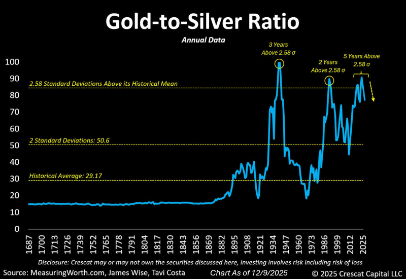
⬤ The chart marks multiple occasions when the ratio climbed more than 2.58 standard deviations above its historical average. Each of those past spikes ended in a rapid retreat toward ordinary levels. One observer wrote, “Even though the same pattern appears across centuries of data, traders in real time usually explain such extremes as permanent shifts instead of brief departures.” That way of thinking is why most participants only notice the turn long after it has started.
⬤ The present slide appears to be the early stage of a larger return toward the mean. After years at rarefied heights, the ratio has dropped steeply echoing the retreats that followed earlier peaks. Historical charts make each inflection look clear - yet few investors spot the shift while it unfolds.
⬤ If the ratio keeps falling, the structure of the precious metals market may change. A persistent decline would point to silver outperforming gold and would alter how traders assess risk in the sector. The drop indicates that a long lasting imbalance has begun to correct drawing the link between the two metals closer to its usual range.
 Marina Lyubimova