Saad Ullah
XRP forms a bullish triangle eerily similar to 2017's massive breakout. Traders are calling this the final entry point before potential explosive gains.
XRP Chart Mirrors Historic 2017 Breakout Pattern
A sharp-eyed trader on X has spotted what they're calling a "Golden Entry" opportunity on XRP's monthly chart. The pattern looks strikingly similar to the 2017 setup that launched XRP from pennies to nearly $3.50 in one of crypto's most explosive runs.
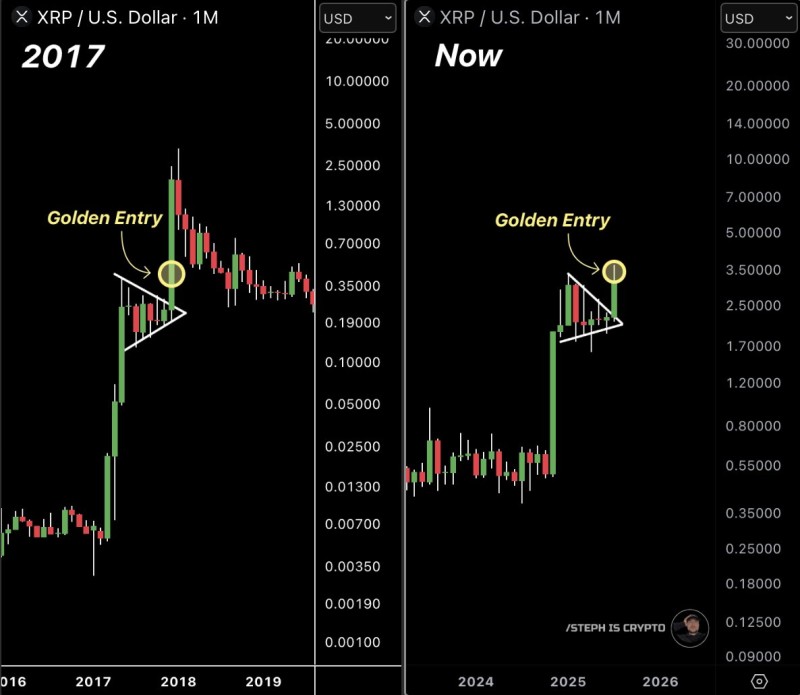
Back in 2017, XRP carved out a textbook symmetrical triangle before absolutely erupting. The token went from trading under $0.01 to hitting $3.50 — a mind-blowing rally that made early holders incredibly wealthy. Now, according to the technical analysis making rounds on social media, XRP appears to be painting the exact same picture.
The current formation shows XRP breaking above the triangle's resistance, with the monthly chart confirming the breakout above $2.70. For those who missed the 2017 boat, this could be déjà vu in the best possible way.
XRP Price Targets Astronomical Levels
If history rhymes rather than repeats, XRP holders might be in for quite a ride. The breakout pattern suggests potential targets well above $5.00, with some optimistic projections reaching $14.00 to $20.00 based on logarithmic scaling.
The trader who shared the comparison didn't mince words: "This is your final chance to get rich." While that's obviously speculative hype, the technical setup does look compelling. Symmetrical triangles often lead to powerful moves, especially when they play out over such long timeframes.
Of course, past performance doesn't guarantee future results, and crypto markets are notoriously unpredictable. But for XRP believers, this chart pattern offers a tantalizing glimpse of what might be possible if the stars align once again.
 Saad Ullah